SparkAPT
INTRODUCTION |
SparkAPT is a B2B SaaS company that offers a software solution for agents and brokers to automate client management + the apartment locating experience.
We took on the project with 3 specific goals in mind based on SparkAPT's business needs:
Goal 1 was to increase the number of subscribers that were coming to the software.
Goal 2 was to reduce churn rate of existing users.
Goal 3 was to reduce user confusion of the available features.
RESEARCH |
To kick off the redesign, I needed a solid research plan to uncover the real problems with the Kinokuniya website. My goal was to pinpoint the key issues and understand them deeply. Here’s how I approached it:
Heuristic Analysis
I started by evaluating the site using Nielsen’s Ten Heuristics. This helped me systematically identify the most critical usability issues, prioritize them, and focus on areas where improvements would make the biggest impact.Competitor + Comparative Analysis (C+C Analysis)
We began by examining www.smartapartmentdata.com, a platform offering similar services. Their landing page stood out for its organized navigation, separate pricing page, credibility through company metrics, customer feedback, and visual presentation of features. They also addressed user questions prominently.Landing Page - They avoided prominently displaying logos, instead using bold hero statements paired with images or product visuals to set the context.
Their sign-up language was more inviting, with phrases like “Get Started” instead of “Free Trial.”
Many structured their sign-up process to begin with email, simplifying the entry point for users.
User Interviews
To better understand SparkAPT’s user base—agents helping clients with apartment searches—we set out to explore their workflow. We asked questions about the tools they use, how they manage clients, their preferred devices, their understanding of SparkAPT’s functionality, and how they perform tasks like sending properties to clients.
DESIGN |
Once we had defined our problem statement and completed the research phase of our process, we moved onto the next stage which was to transform that data into a visual design. This was going to be focused on two aspects:
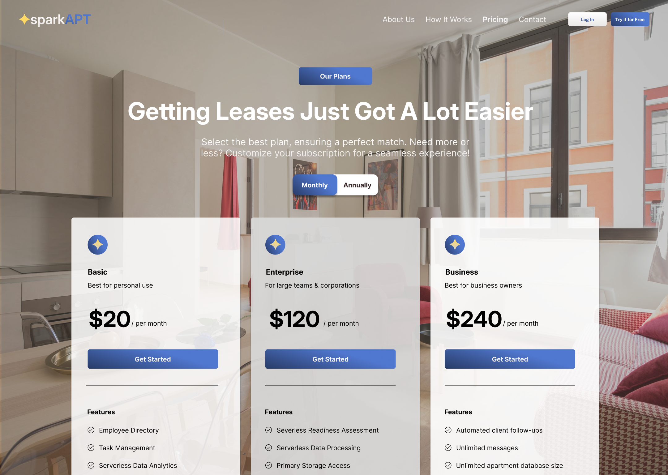
Landing Page | Website Redesign - Add pertinent information to inform new users of what the software actually does
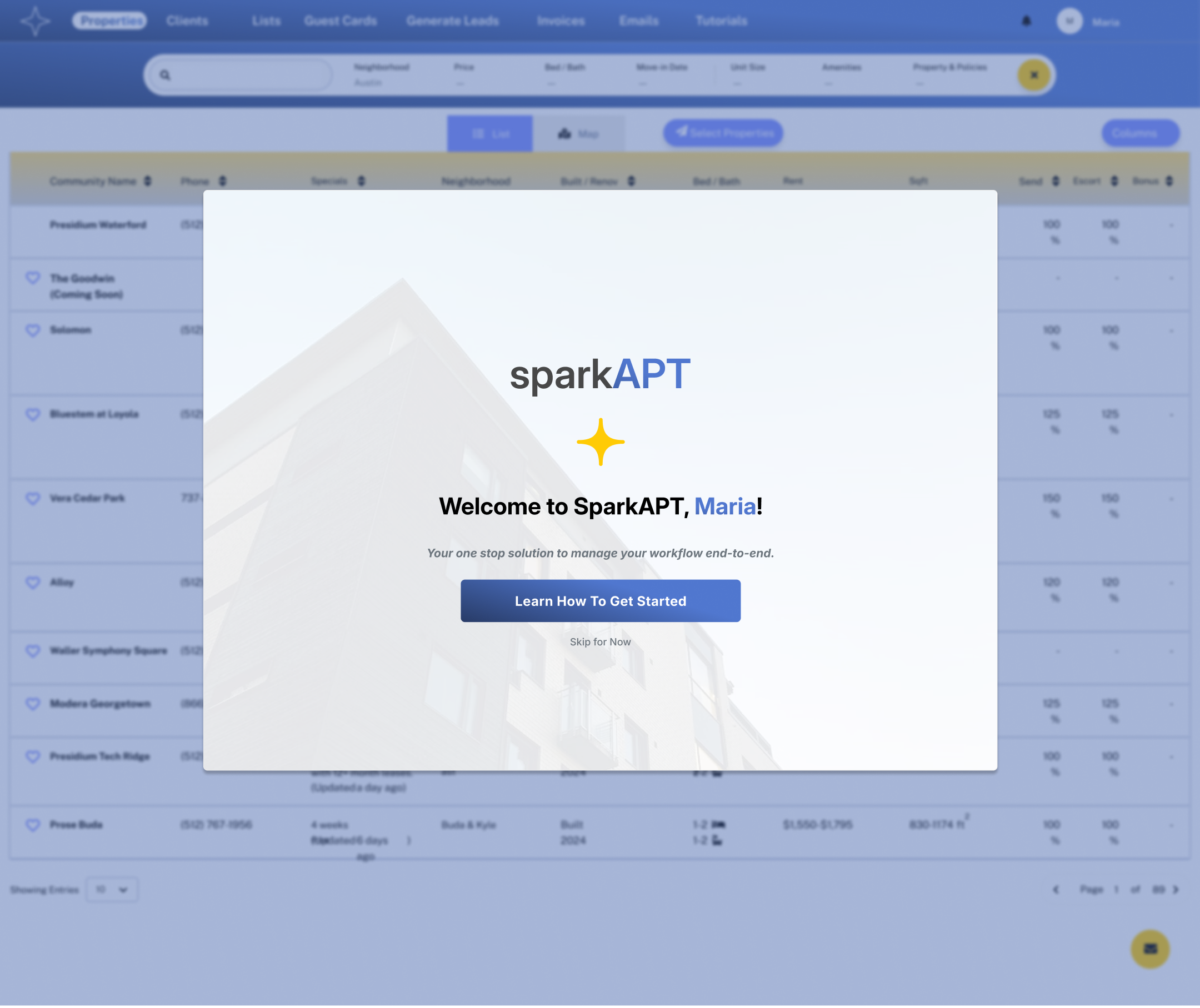
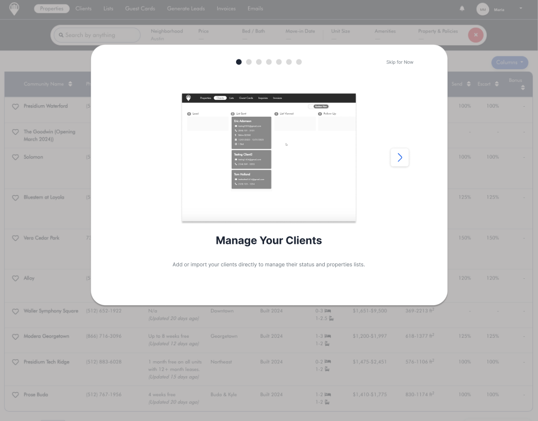
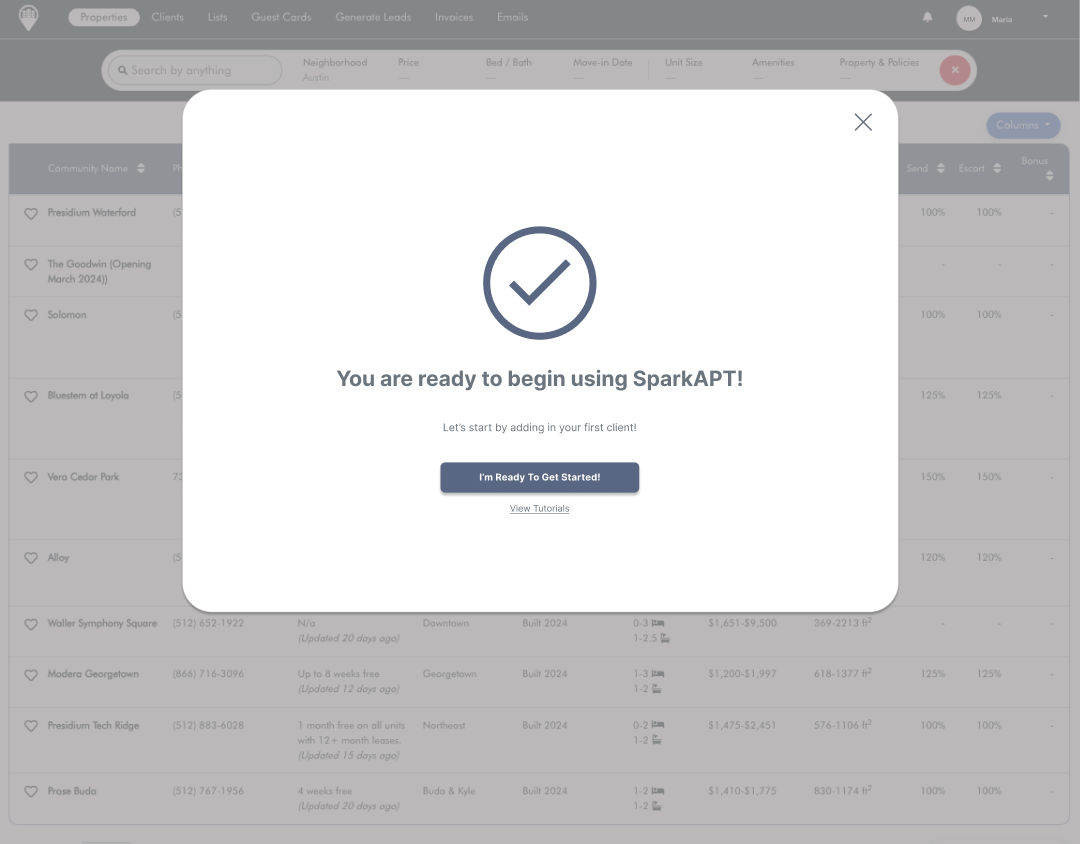
Onboarding Process | Tutorials - Guide new users on how to use and navigate these features effectively once they are logged in
These we felt offered a solution to address the overlap of issues faced by both customers and the owners of SparkAPT.
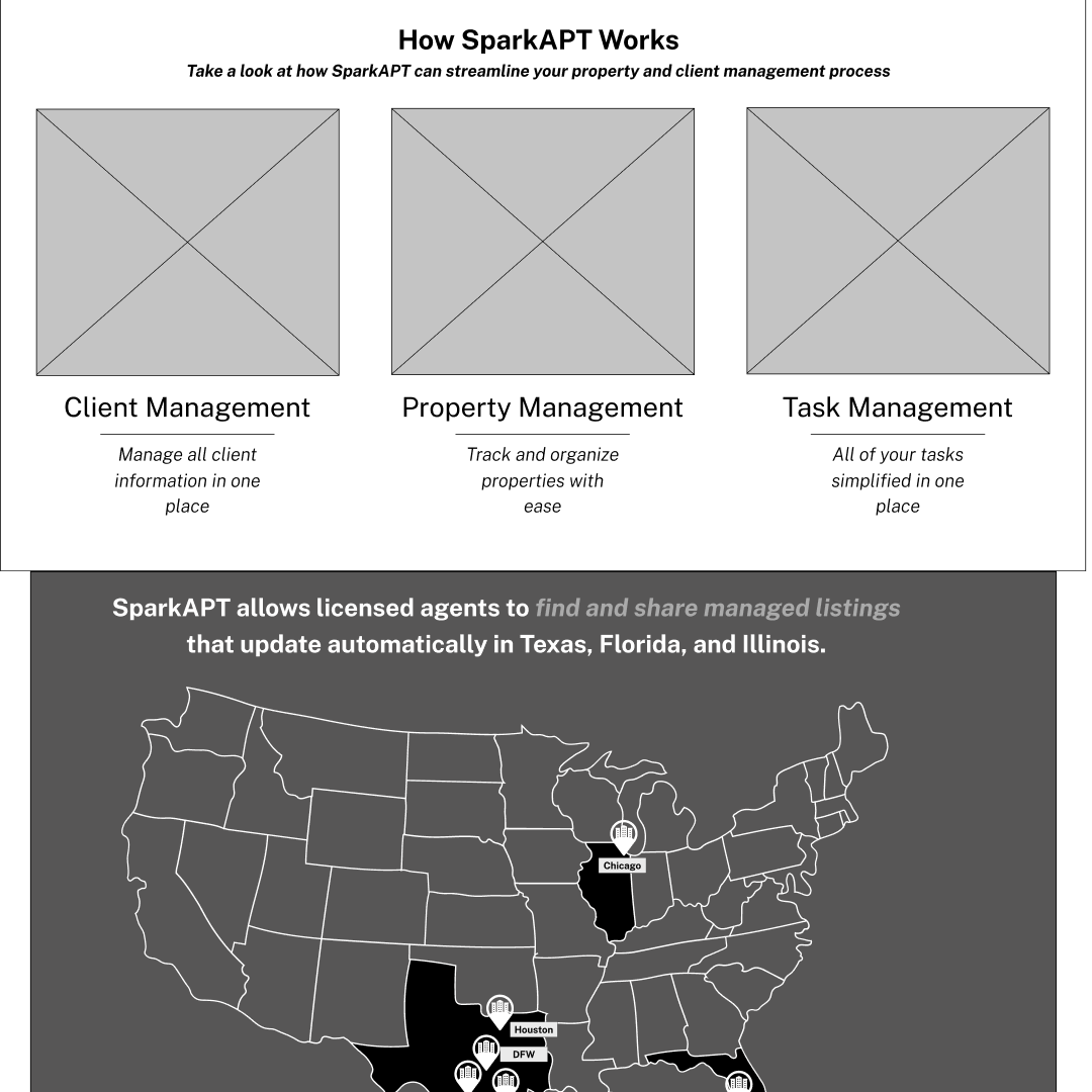
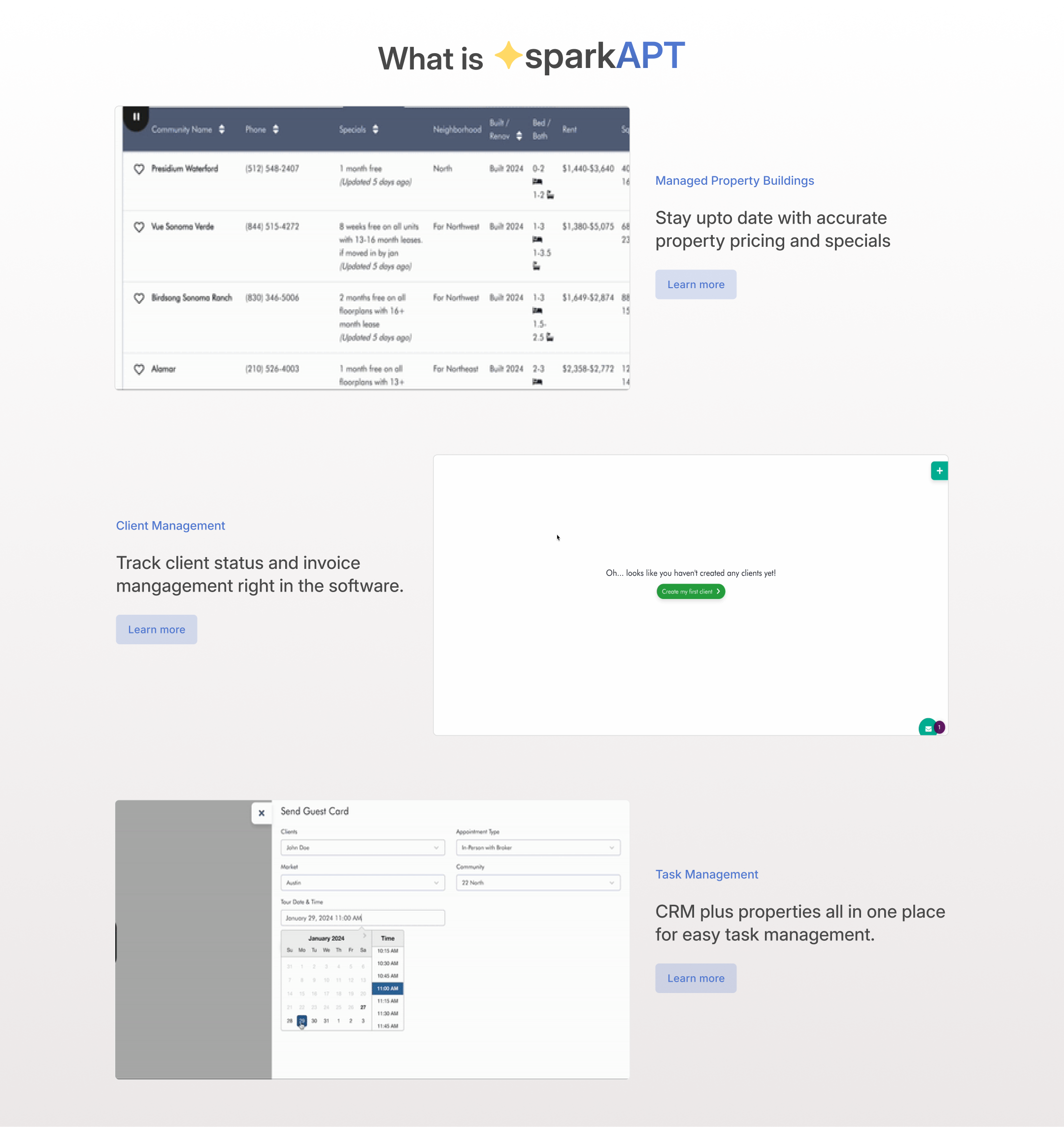
The goal here was to tackle the major issues SparkAPT was facing and we did so through a bold design for our landing page, which is evident in the mid-fidelity prototype. This page prominently displays various sections that highlight the product's features, functionalities, and FAQs, offering users a clear understanding of what they're getting before signing up.
Additionally, we focused on developing an onboarding flow to guide new users on how to use and navigate these features effectively once they are logged in.
The goal of the landing page redesign was to focus on creating a bold landing page that would capture new users attention and make them curious to learn more. This included adding information about the software with taglines that were not on the existing page.
The functionalities section was to showcase what the software solution of SparkAPT actually allowed you to do.
The features section was focused on utilizing clean succinct language to inform about the specific additional features a user can perform with SparkAPT.
Onboarding
For the second portion we were looking to work on was an onboarding flow to help inform new users who had just signed up for the first time. It was meant to help them understand how to use those features, how to navigate them, and how that would work once you're in there.
USER FEEDBACK |
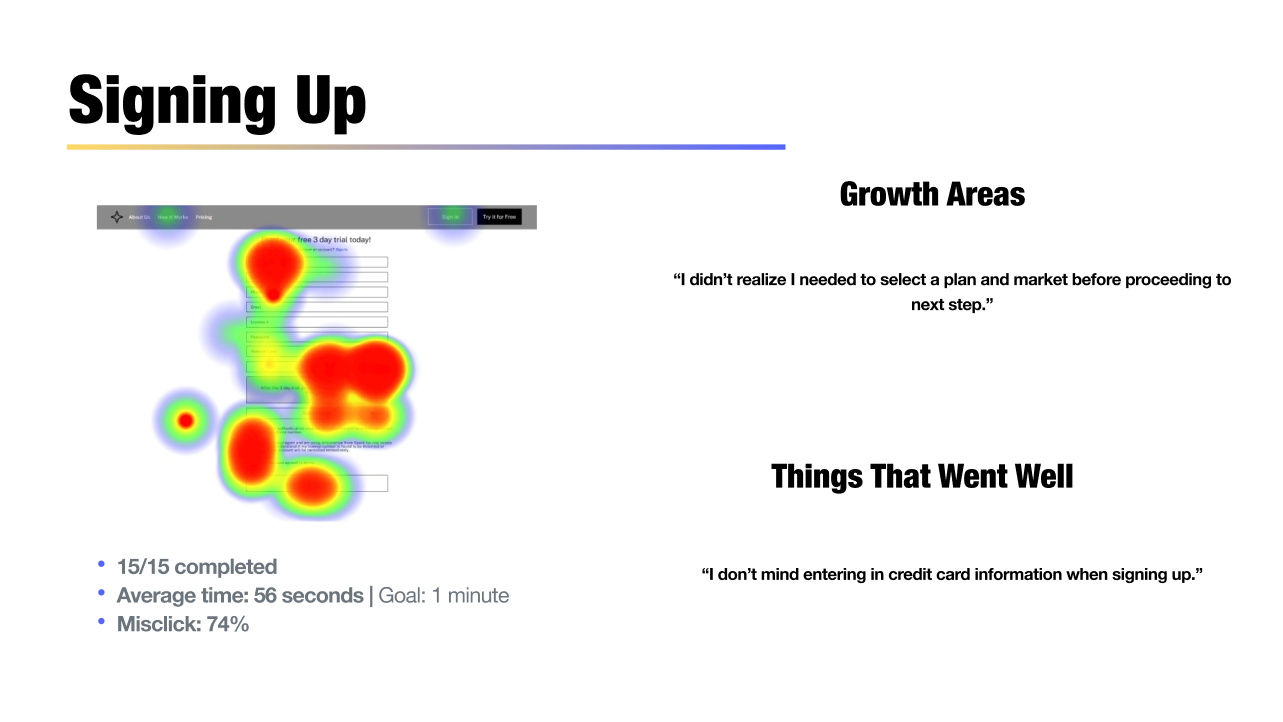
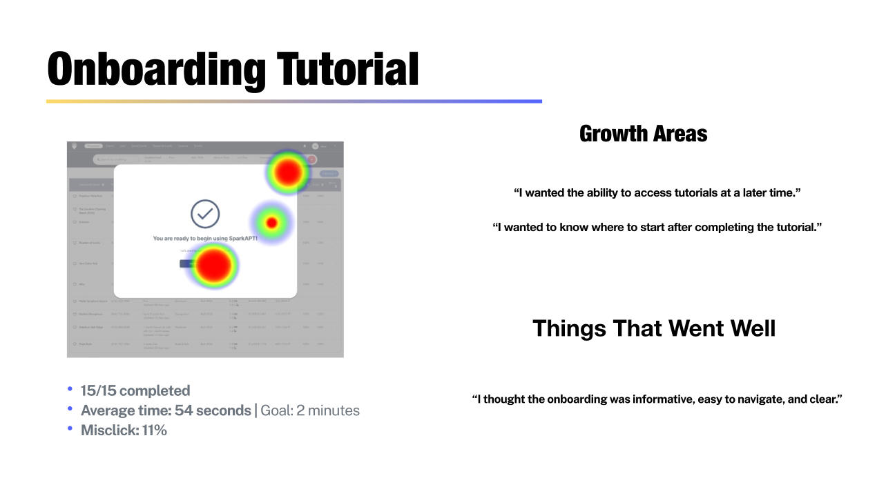
Once the designs and layouts had been created, the next step was to test the designs with users to get feedback. There was a few goals behind the inspiration of the design and so I wanted to be sure there was an opportunity to see if that was reflected in the design without having it be explained. Below is a breakdown of the main research objectives and the tasks users were asked to complete.
Research Objectives
To learn if the user was able to successfully complete the task
To learn if there might be user confusion during website navigation
To capture feedback on quality of information and layout
User Tasks to Complete
Browse landing page and features
Review and select a pricing plan
Complete onboarding tutorial
